Helping first time home-owners understand their purchase power
Redesigned Credible’s pre-approval dashboard focused on their digital mortgage UX experience (home purchase options); reducing confusion, personalize next steps, and drive loan conversion. Improvements led to stronger engagement across buyer types, supporting both early-stage "dreamers" and ready-to-act borrowers.
Overview
Credible offers a pre-approval form flow designed to help users explore mortgage options without needing a hard credit check. Visitors complete a three-step form covering property details, financials, and personal information. This generates a pre-approval estimate, giving users a sense of their buying power and helping them navigate the home search process.
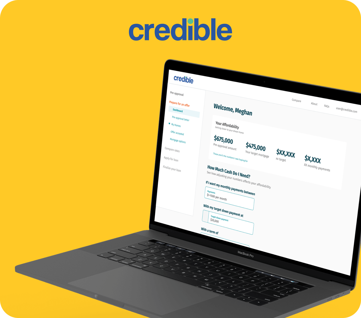
After completing the form, users land on a dashboard highlighting their pre-approved mortgage number and next steps. Three core CTAs are featured: generate a pre-approval letter, compare mortgage rates, and confirm “my offer was accepted.” However, only 0.1% of users completed the most critical flow: applying for a loan through a lender, which officially begins the borrowing process.
A heuristic evaluation revealed two key blockers. First, the lack of hierarchy between CTAs created confusion around what to do next. Second, the dashboard didn’t explain the purpose or value of each action, making it hard for users to see how Credible could support their journey. As a result, many hesitated to move forward. Mortgages are high-stakes, emotionally charged decisions—especially for first-time buyers. Some users may seek in-person guidance, while others value a digital experience that’s clear, supportive, and trustworthy.
For Credible to succeed, the product must not only convert, it must guide users confidently through a complex process in a fully digital space.
Goals
- Improve conversion rates by helping users understand their next steps toward securing a loan.
- Personalize dashboard content based on user intent and readiness to buy.
- Reduce decision paralysis by simplifying the call-to-action experience.
- Increase engagement by making educational tools more interactive and scenario-driven.
My role
I led the UX strategy and end-to-end redesign of Credible’s mortgage pre-approval dashboard to increase clarity, personalization, and conversion. This included stakeholder alignment, user research with both homebuyers and loan officers, usability testing, and the creation of tailored MVP experiences for different buyer personas. I also implemented live user surveys and data-driven dashboards to uncover intent and guide design decisions.
The process
The main question throughout research was what potential features could solve current user pain points experienced in our flow. We held brainstorming sessions and mapped out task analysis, user journeys, and our current flow to hypothesize what features could solve those pain points. Features were broken up into segments based on where a user might be within their home buying journey. We learned that some users come to credible to understand their home buying power. They were curious to understand how much money they could be approved for and how that translated to a home. We referred to them as "dreamers" since they expressed their intent was low, and they wouldn't be ready to purchase anything for a few years, but liked to daydream about the potential.
UXR format & results
I led four research sessions with loan officers to understand how buyers prioritize stages of the mortgage journey and which educational moments matter most. We also interviewed returning homebuyers to uncover pain points from their first purchase and what they'd want in a second.
To supplement this, we ran three unmoderated tests with 30 users via UserTesting.com to gather feedback on key pain points and the current dashboard experience—an approach chosen to protect sensitive loan data.
We gained early insights from a 30 day survey we ran on our pre-approval dashboard, reaching 108 users. The results reflected each users core intent with Credible:
- I want to browse rates (44.4% or 49 users)
- I want to know how much I can be pre-approved for (22.2% or 24 users)
- I want to create a pre-approval letter (13.9% or 15 users)
- I want to shop for mortgage rates (10.2% or 11 users)
- I am looking for next steps (6.5% or 7 users)
- I want to find a real estate agent (0.9% or 1 user)
- Other (0.9% or 1 user)
Key Insights
Intent matters more than persona: Through surveys and usability tests, we found that purchase intent and stage were better indicators of user behavior than traditional demographic personas. This insight shaped our approach to personalized dashboard views.
"Dreamers" still deserve value: Nearly 45% of users reported browsing with low purchase intent. Designing lightweight, educational tools for this group increased early engagement and created long-term brand trust—without pressuring them to convert prematurely.
Users need clarity, not more options: Our interviews and journey mapping uncovered that users didn’t necessarily need more actions—they needed more confidence in which action was right. Prioritizing clarity of next steps directly impacted engagement rates.
Affordability is a top driver: Consistently, users ranked monthly payment estimates and affordability levers as the most important elements in their decision-making process. Tools that visualized real-life trade-offs were among the most valued features we tested.
Solution
- A personalized dashboard experience with three distinct versions based on user intent (e.g., browsing, preparing, or ready to buy).
- Context-aware CTAs that guide users through their next best action, removing ambiguity and increasing relevance.
- Interactive educational tools that allow users to explore how down payments and loan amounts affect affordability and outcomes.
- Embedded market insights (e.g., average home sizes, monthly payment ranges) to help users visualize trade-offs and feel confident in their decisions.
- Live surveys and analytics to continuously measure user behavior and fine-tune dashboard content in real time.
Impact & outcomes
Increased return intent: By tailoring dashboard experiences to different buyer mindsets—from early dreamers to ready-to-close buyers—we increased "stickiness," encouraging users to revisit Credible as their intent matured.
Validated feature direction: Qualitative feedback from moderated and unmoderated sessions reinforced that personalization, clarity of next steps, and financial transparency were critical to user trust and decision-making.
Reflections
Designing for digital mortgage space means designing for trust, emotion, and long decision cycles. By aligning the dashboard to user readiness and demystifying next steps, we created a more approachable path through a complex financial process. This project reinforced that design isn’t just about optimizing for conversions—it’s about meeting people where they are and guiding them forward with confidence.